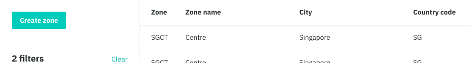
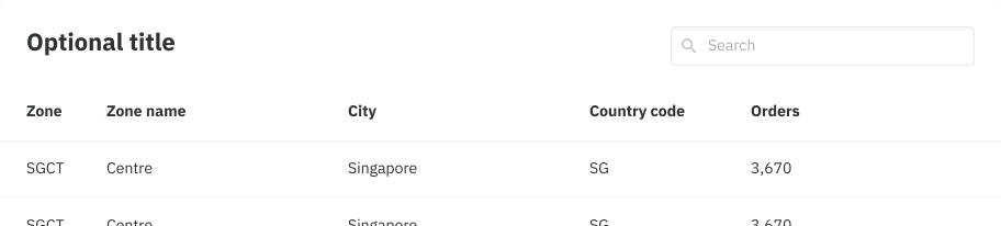
A list of repeated data that can make up many columns. Right now we have Simple Table and Standalone Table variations that can be used (yes, questionable naming).
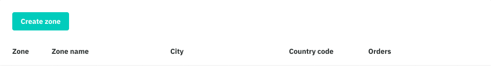
Simple Table
A simple table is an extremely basic implementation of a table with limited functionality.
Functionality
- Content inside a simple table is read-only text, thus no interactive elements can be used here.
- Use our Table component for added functionality such as row actions and filtering.
Fixed columns
- All columns have predefined width that is consistent across each column, thus it does not dynamically respond to the content that is inside it. This can be customised.
Padding
- By default it is set to Compact (8) since it is generally inside a card with many other page elements.
- There is also a larger 16 option for prominence or in a card on it’s own, but is rarely used.
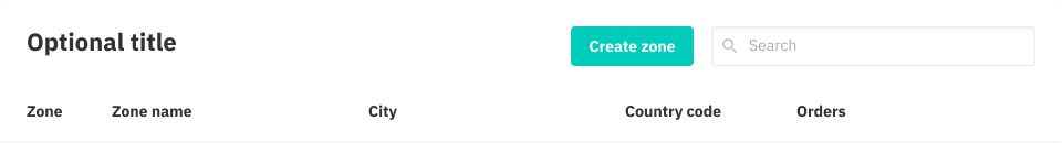
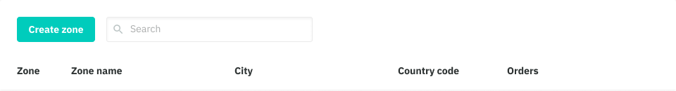
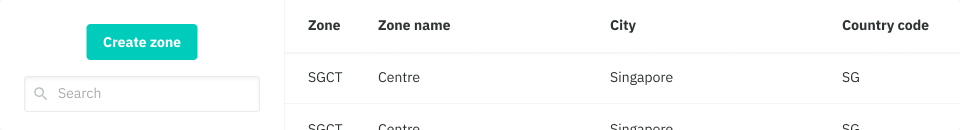
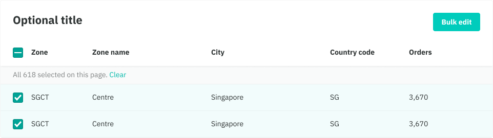
Standalone Table
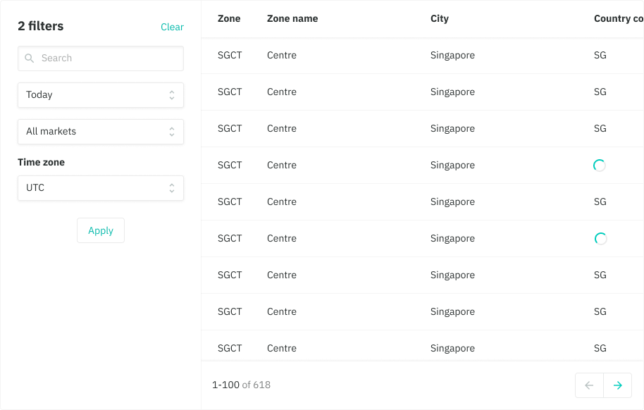
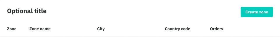
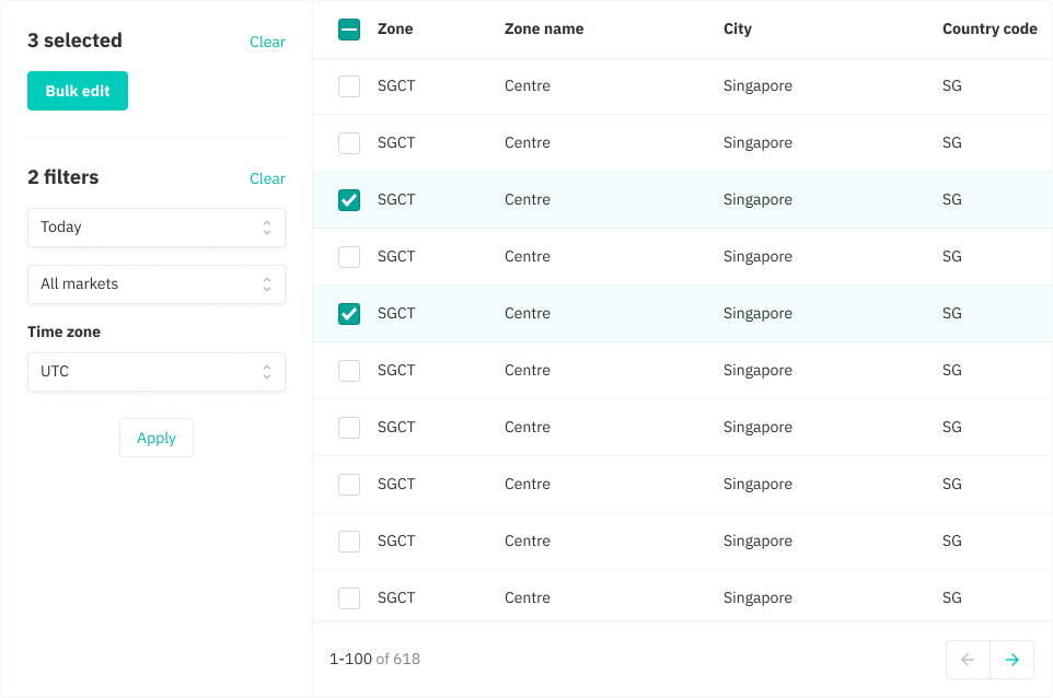
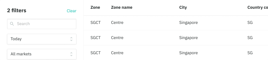
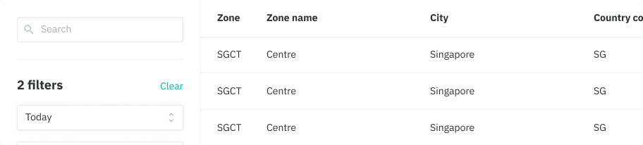
Standalone tables are typically used when tables have a larger data set that requires interactions like filtering, selecting and supplementary content. They sit within a card by themselves, in this case but they don’t have to be the only card on the page. A table can include:
- Supplementary content like tags, table title,
- Vertical and horiztonal scrolling
- Custom column widths (based on flex layout)
- Row-level and table-level actions like selecting and editing
- Filtering
- Sorting
- Search
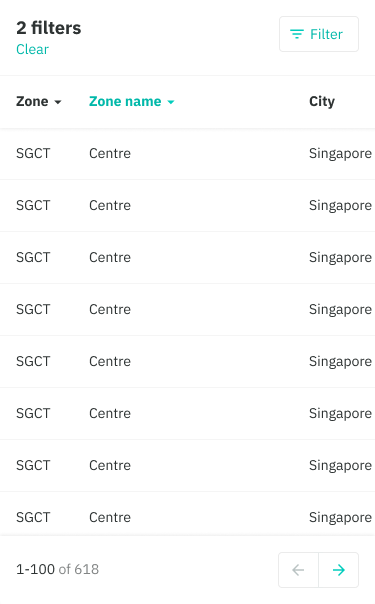
- Pagination
All of these are optional, and the layout will change based on what “modules” you show. For example, if you want filters, then you have a sidebar. That means primary actions, or selection actions, will sit in the sidebar instead of above the table.
Actions - Table level
- A primary button can be used to directly manipulate the data below, such as inviting a team member to your restaurant site or to bulk edit several items. It is the most uppermost element of a table, positioned above the table except when filters are being used, it then becomes a part of the sidebar placed above the filters. A primary button can contain several actions behind it if required.
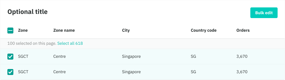
- When it is possible to select items in a table, at the column level the checkbox will allow you to select all items.When paginated it will only select the set of items that you are in. A small area will appear below the column headers which will allow to select all items in the entire data set, followed by a clear option.
- Pagination can be used as a means of navigating between different sets of data (more on that below)

Actions - Row level
- Use checkboxes when a customer requires to take an action on many items eg. the supply team deciding if certain zones require more riders .
- Aside from checkboxes, icon actions such as edit can be included at the end of the row.
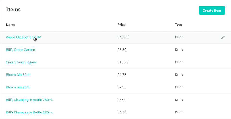
- If you wish to view more details of a row/item, make the item name a link, and positioned in the frst column.
- If there is more than 3 icon actions available it is best practice to hide it behind a ‘more’ icon, showing the individual actions inside a popover
- Text actions can be used for more ambigious actions where an icon would not suffice eg. downloading different file formats like PDF and CSV.
- There is future plans to rethink and consolidate our tables


Filtering and sorting
Sorting
- Use sorting as a means of organising rows on columns you aniticipate or have validated as need from customers.
- A sortable column is indicated with a mackerel caret icon, which can be sorted alphabetically and numerically.
- When a sorted column is active, the column’s label and icon is highlighted teal.
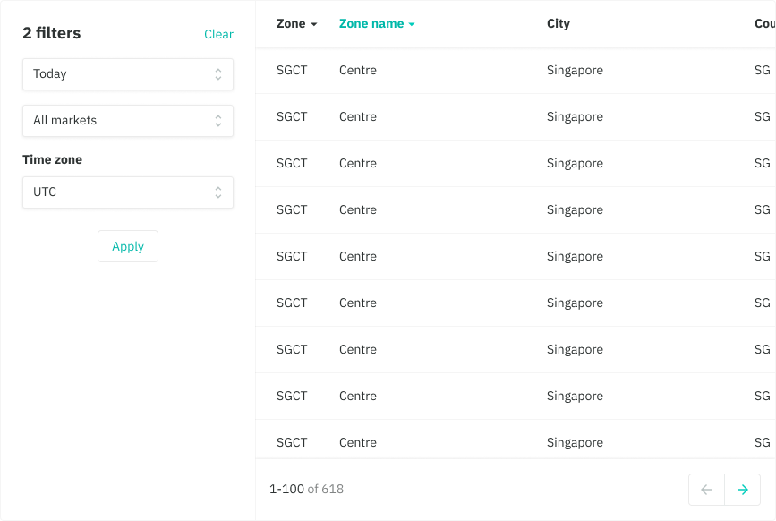
Filtering
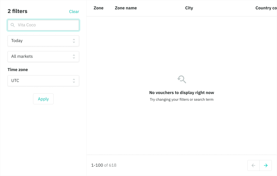
- Use filtering as a means of quickly narrowing down the data presented in the table.
- This is more beneficial on tables that have a large data-set such as an organisations restaurant where a customer can filter their restaurant sites by country, cities, zones etc.
- On mobile, the filters is hidden by a ‘Filter’ button which onclick returns a fullscreen modal with all your fitler options.
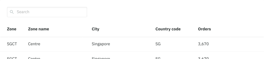
Search
Use Search to help customers find specific keywords in realtime, in cases where filtering through specific inputs is not enough or not required.
Input placement:
- When there’s a card title it appears in the top right
- When there’s no card title it appears in the top left.
- Search can either be shown standalone outside the filters, or as part of the filters. Having it outside the filters, usually indicates the table is empty to start with and requires an initial search. This is not very common (and perhaps should not exist to begin with) Having search as part of the filters would narrow down results that are already shown in the table.
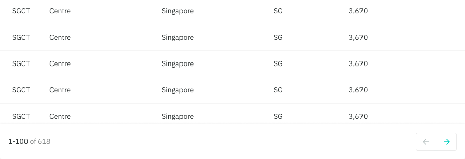
Pagination
Pagination let’s our users move through a collocation of items that has been divided into several sets.
- component is logically placed below the table as a sticky footer
- an indicator on the left shows the range of items on that exact set, as well the total number of items inside the table
- customers can use the left and right arrow buttons to navigate through all the sets
- pagination can toggled on or off, but should always be on for items over 100
✏️ No search results
Scenario:
The user has selected filters or a combination of filters that don’t yield any results.
Note:
If the original action exists on the same page, then you don’t need a CTA within the empty state.