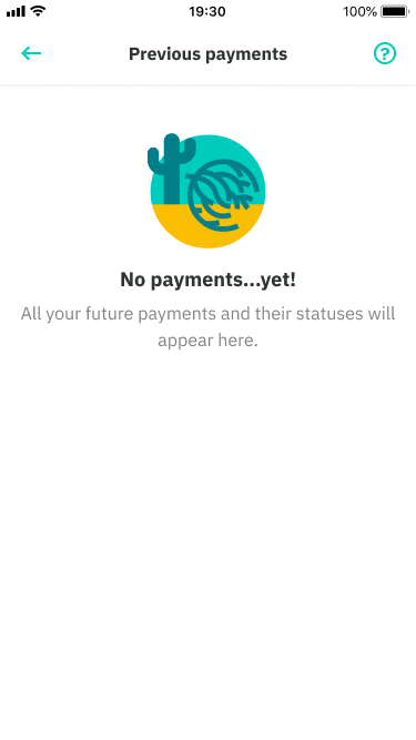
Empty states are a key point in the user journey. They are opportunities to build rappot, drive engagement, educate or delight the user. Your empty states should never actually feel empty.
Best practice
- Use empty states when there is no data shown eg. first use, errors and cleared
- Ideally, they should explain the next steps the user should take and provide guidance with a clear CTA (optional)
- First use: use when a person first interacts with the application or feature
- Cleared: use when a person has just completed a task, workflow, or has cleared all data associated with a large component
- Errors: use when a person has encountered a blocker during the interaction. It should be communicated in a way that is both helpful (what the error is) and makes sense (why it happened).
Desktop
Mobile
Actions change state over time
Scenario
The user can’t change this empty state immediately. Multiple steps.
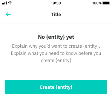
Create data from state
Scenario
The user hasn’t populated the state yet. They can populate the data from the empty state.
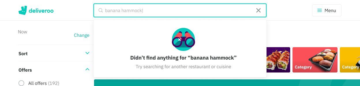
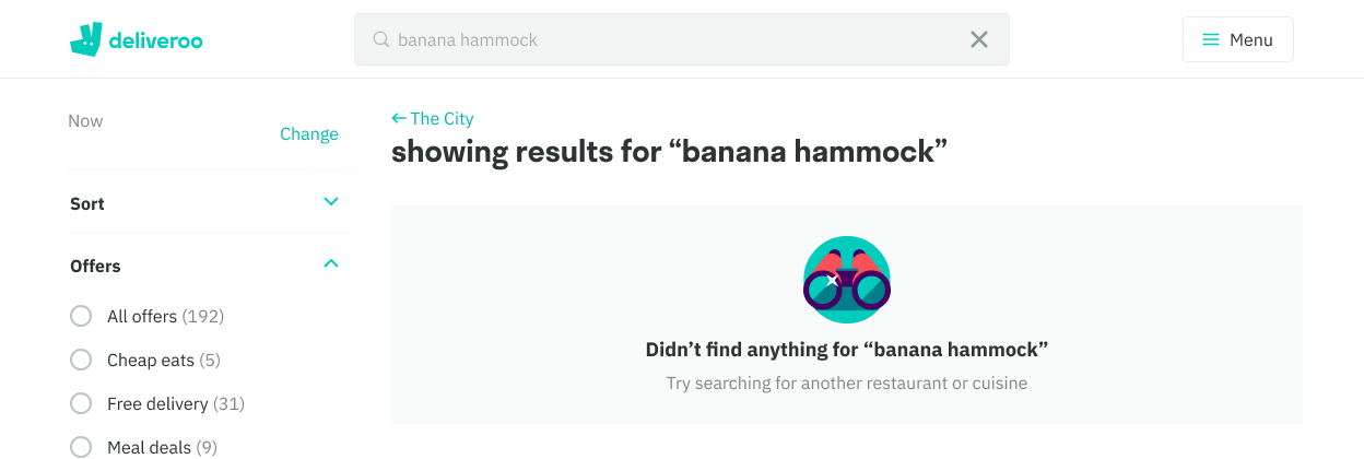
No search results
Scenario
The user has selected filters or a combination of filters that don’t yield any results.
Note
If the original action exists on the same page, then you don’t need a CTA within the empty state.

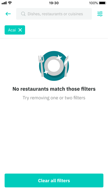
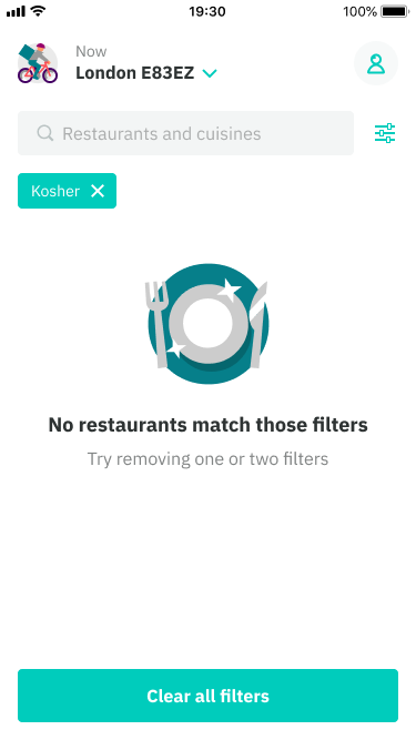
Change state to get data
Scenario
The user has selected filters or a combination of filters that don’t yield any results.
Note
If the original action exists on the same page, then you don’t need a CTA within the empty state.