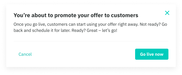
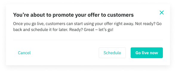
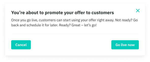
Modals are actionable overlays that prevent users interacting with the rest of the application. They require an action to be taken until you can return to the previous view.
Modals should be used sparingly as they are disruptive to the experience. There are three types available: Basic, Sheet and Large.
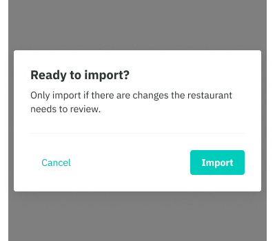
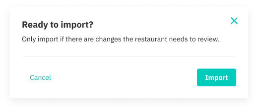
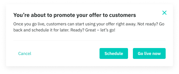
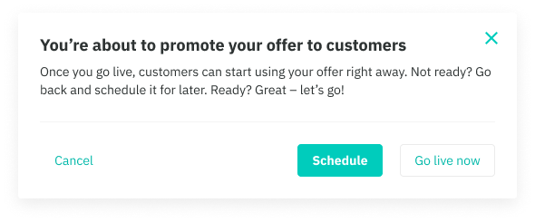
Basic modal
This is our default modal which contains buttons and a ‘cross’ icon in the top right.
- Use if you need to add an additional confirmation step to your task
- The modal can be dismissed through clicking the cross icon, the dark overlay background and the CTAs
- Our buttons are positioned in accordance to backward/forward actions eg. Left side button is reserved for 'going back' actions such as Cancel while right side buttons are reserved for primary and secondary actions
- On mobile, the ‘cross’ icon is removed. This is done in code, and from an IXD perspective is something that will be addressed.
Mobile Web
Web
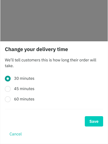
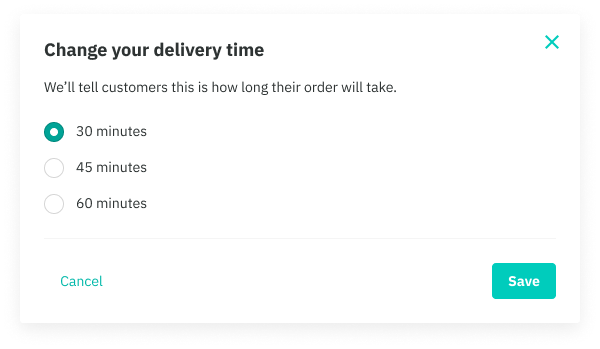
Bottom sheet modal
Our bottom sheet modal is a mobile-only flyup, that is commonly used across different mobile platforms. It can be used on Web, but will appear like our basic modal.
- Use a sheet modal when you require additional interactive elements such as prompts or multi-selects.
- The modal can be dismissed through the ‘cross’ icon, the dark overlay background and the CTAs.
- The sheet is positioned at the bottom of the device and flys up beneath the device’s real estate.
Mobile Web
Web
Large (fullscreen) modal
Our large modal is bigger both in width and height, allowing for significantly more content to be shown above the fold.
- Width is normally kept to around 560 max, but the height can fit to the boundaries of the browser window.
- Use a large modal if there’s a lot of content that requires more real estate. Ultimately, it should be crucial to the experience eg. selectable lists
- Large modals can be nested, thus allowing for additional navigational elements such as a ‘back’ icon.
- On mobile, the modal expands fullscreen, taking up the entire real estate of the device
- Navigational elements such as the ‘back’ and ‘cross’ icon can be removed in certain cases eg. in Restaurants for new orders, these elements are removed because the person is forced to either reject or accept that order. This is very a specific use case and should be avoided if possible.
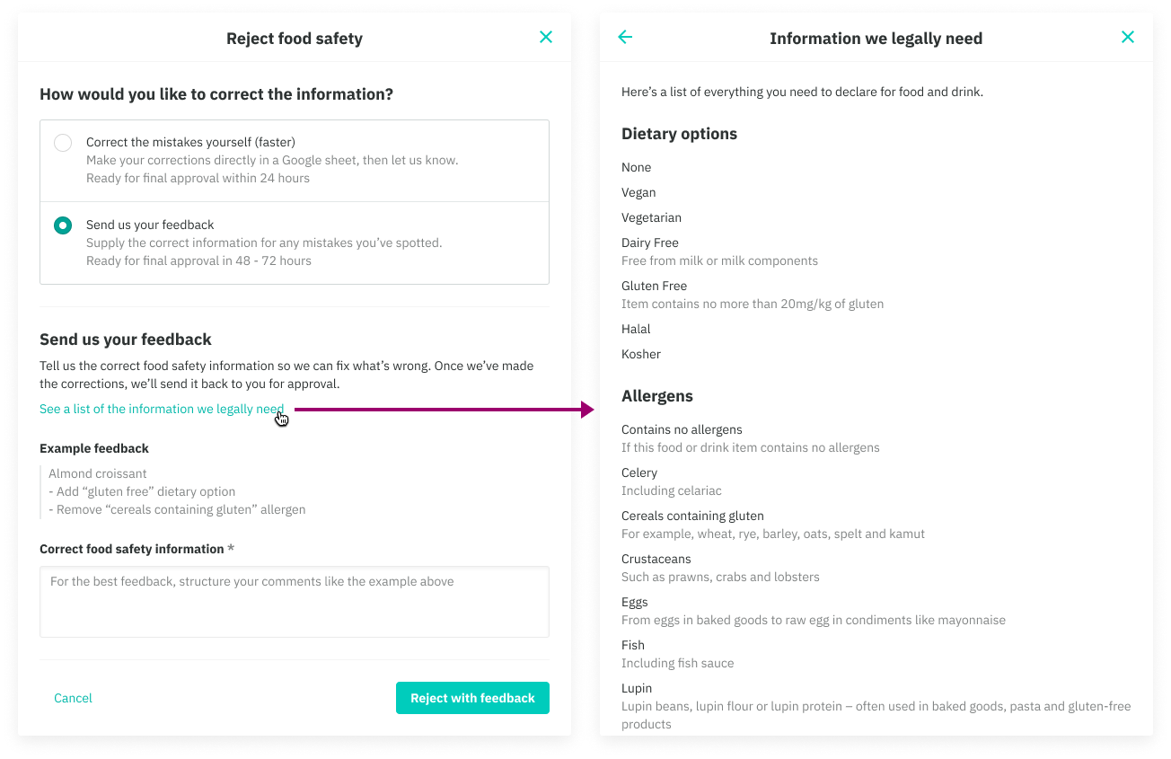
Best practices
- Left side is reserved for backwards actions only
- Avoid using two buttons of the same style as this creates unclear action hierarchy. Likewise, there should always and only ever be one primary button.
- Avoid using more than two buttons at the bottom. This prevents unclear action hierarchy and crowding on mobile screens. However since the left side is reserved for backward actions, a secondary action beside your primary action may be appropriate.
- Ensure the correct modal is being used based on the guidelines above
Do
Don't

Alternative components
- To show large amounts of additional content and do not require an additional confirmation step, use our Aside page layout
- To show smaller amounts of content or a set of actions in a non-blocking overlay, use our Popover
- To communicate a change of state that requires attention within the context of a page, use our System banner or our Page banner which allows for an optional illustration badge
Aside page layout
Popover
System banner (inline)
System banner (inline)