Graphs are a great way of communicating large amounts of data in a more visual way such as prep time vs zone prep time, total orders etc.
Git: https://github.com/uber/react-vis
Storybook: http://uber.github.io/react-vis/website/dist/storybook/index.html
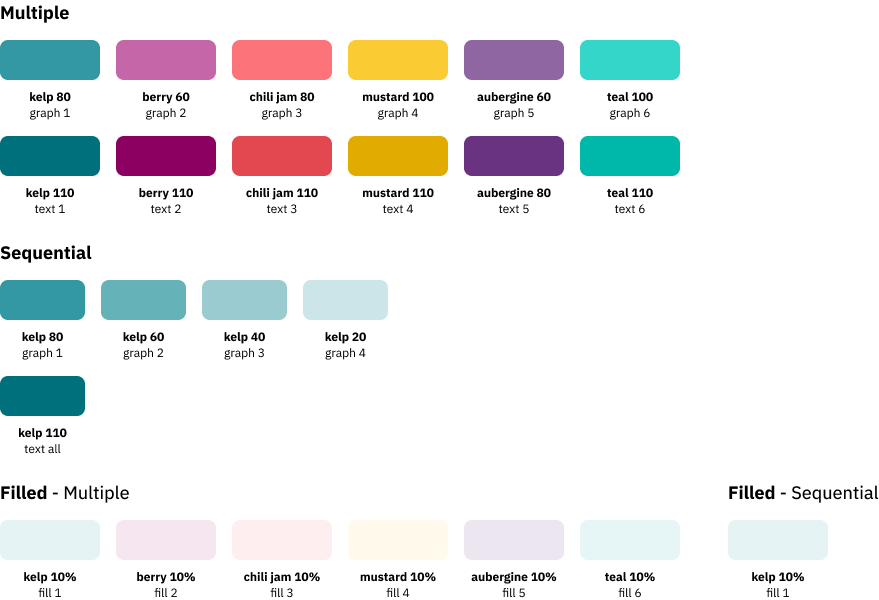
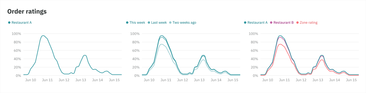
Color theming
Aside from your default one graph line, we also have color themes when dealing with different variations:
Multiple - When comparing variables of different data groups eg. Restaurant A, Restaurant B. Colors are setup to contrast from one another.
Sequential - When comparing the same variable but at different points of time eg. last week, this week etc. Because of this, they are shades of one color.
Filled - A transparent fill that can be used in all of the above. This allows you to see the lines of the chart and overlaps. Similar to the behaviour of an Area graph (see section on best practices)
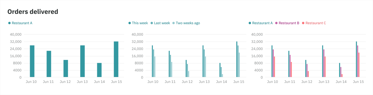
Bar graph
Bar graphs are used to compare things between different groups or to track changes over time. They are versatile in the sense that they can represent anything that can fit into categories, or data groups of the same quantity at different points in time, especially units of measurement.
Line graph
Line graphs are used for showing trends over short and long periods of time.
- When smaller changes exist, line graphs are better to use than bar graphs.
- Line graphs can also be used to compare changes over the same period of time for more than one data group (multiple and sequential).
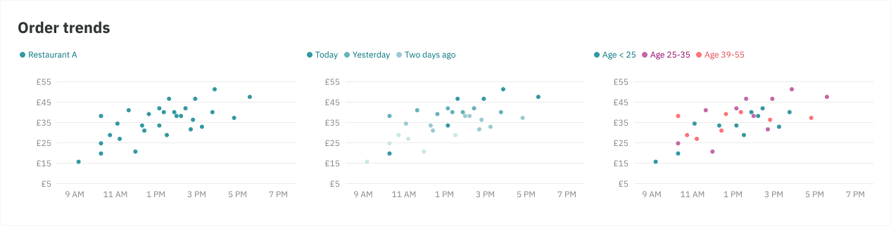
Scatter graph
Scatter graphs are used to determine relationships between the two different things.
- The x-axis is used to measure one variable and the y-axis is used to measure the other eg. the weight and height of a person.
- If both variables increase at the same time, they have a positive relationship. If one variable decreases while the other increases, they have a negative relationship. Sometimes the variables don't follow any pattern and have no relationship.
- Color can also be used on the dots to represent a 3rd variable eg. age groups
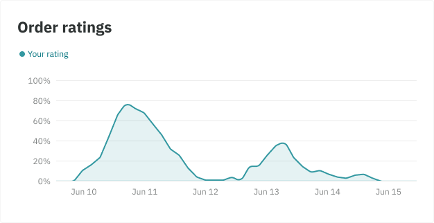
Filled variation - Best practice
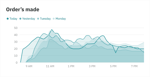
- Use when you wish to add more emphasis to a single line graph
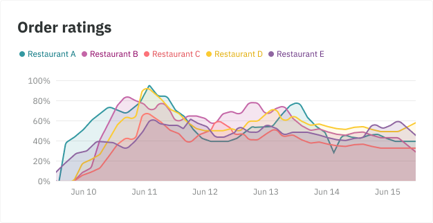
- For multiple line graphs, it becomes hard to show the different data groups clearly as the uppermost layer partially hides the layers behind it, creating a muddy effect. 2 lines work best.
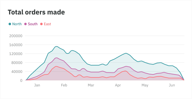
- It’s best suited when you are showing the changes in two or more related groups that make up one whole category (part-to-whole) eg. Total profit by a chain of restaurants
Stacking can give you not only an idea of total orders per month but also the contribution from each region.
- However, it can be difficult to interpret the area of each region precisely as the height of each region is affected by the pattern below it.
- A line chart would be more effective in providing an understanding of the trend of total orders made per month.
Areas of focus: When dealing with a multiple line graph, adding a fill can work great for adding prominence to the change between the two graphs eg. difference in prep time for your site vs zone prep time, or total orders between two restaurants.
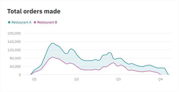
Single graphs: Similar to the above example, adding a fill works great on a single line graph for extra detail or prominence
When there is 2 or more different data groups in a line graph, adding a fill can make your graph appear muddy and lose meaning. Removing fills in this case result in clearer, easier to understand trends.