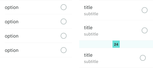
A row is essentiallly a highly customizable list item, used all across our products to accommodate many use cases. Default rows allow the inclusion of many actionable elements.
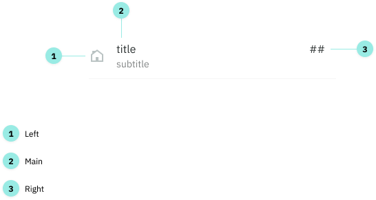
Anatomy
There are three areas that can make up a row: Left, Main and Right.
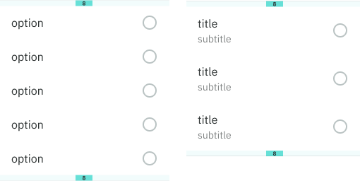
Variations
These three areas can be combined to create different variations.
Options
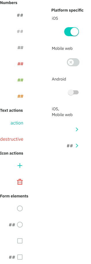
Left
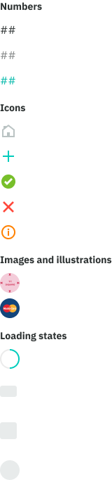
Numbers: primary, secondary, action
Icons: decorative, action, destructive action, feedback related
Form elements: checkboxes, radio buttons
Other: circular images, illustrations and loading states
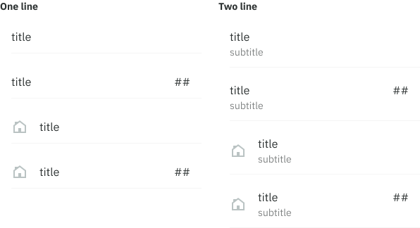
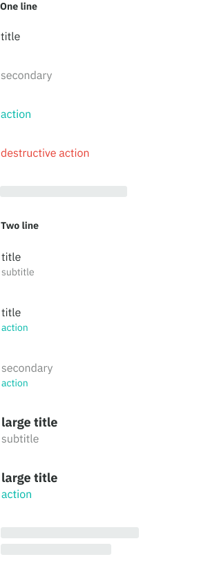
Main
Text-only: primary, secondary, action, destructive action, loading animation, large title (two line only)
A subtitle (secondary, action) can also be included making it a two line row.
Right
Numbers: primary, secondary, secondary bold, feedback related
Text: action, destructive action
Icons: action, destructive action
Form elements: radio buttons, checkboxes, number combos
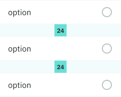
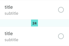
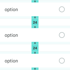
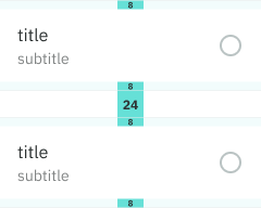
Spacing and padding
iOS + mobile web - single row
- + top/bottom dividers
- + 24pt margin
- - no top/bottom padding
iOS + mobile web - many rows
- + row dividers
- + section dividers
- - no top/bottom padding
Android - many rows
- section dividers
- top/bottom 8pt padding
- no row dividers
Android - single row
- top/bottom dividers
- top/bottom 8pt padding
- 24pt margin