Bars are full-width elements that surface content and actions related to the current screen such as navigating between screens, searching for dishes, sharing restaurants and tabs.
Top app bar
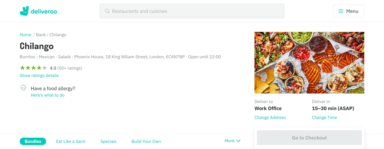
Top app bars are fixed, sticky headers that are positioned at the top of each screen. They include screen titles, navigation and actions.
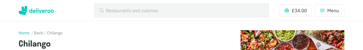
White
This is our default style and should be used everywhere that’s applicable.
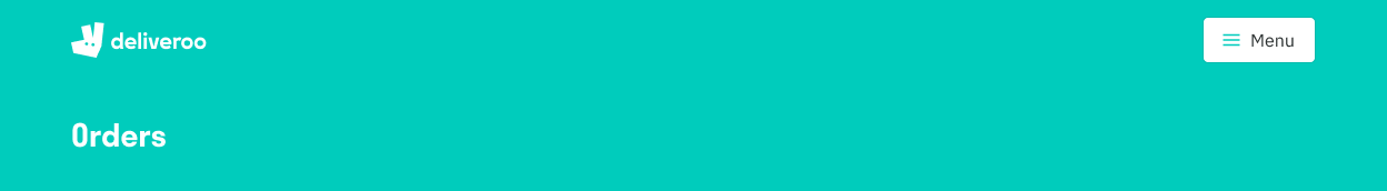
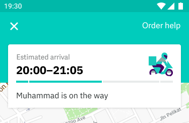
Teal
This was initially our default style, but has slowly been deprecated. This exists on a handful of screens like our Basket screen for Consumer. It allows exists on our external landing pages and the order tracker screen. For the order tracker, it is applicable to use teal as it is overlayed by a large white card that shows key information, thus requiring additional prominence.
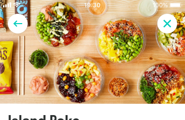
Transparent
We use this above non-color backgrounds like a map view or images eg. the menu page. This should only include key actions such as navigating to the previous screen. Ideally stick to two actions, if there’s more the right side action should be placed behind a ‘more’ icon.
Desktop
Mobile
Content guidelines
- Do make sure the header replays the previous CTA
- Do make sure the header sets user expectations of the page
- Don’t have two headers (one in the top bar and one below) as this is confusing for the user
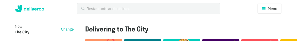
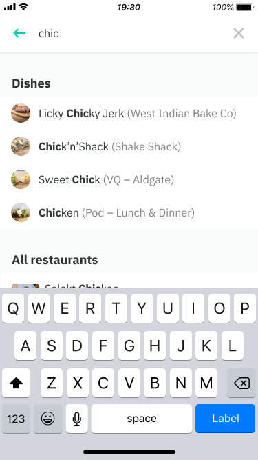
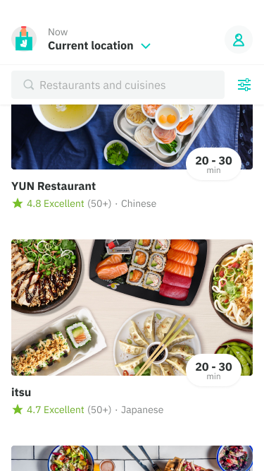
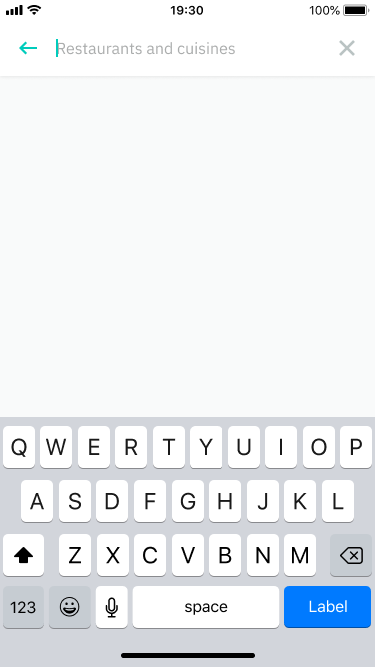
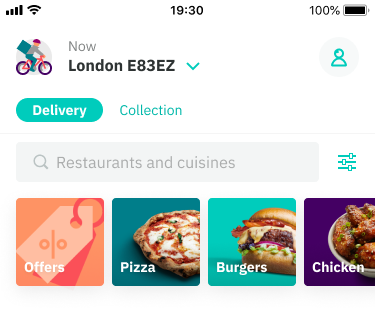
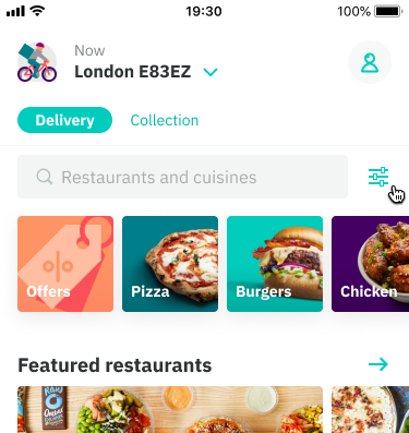
Search bar
When an app supports large amounts of content, users can narrow down results by searching. Search is currently used today to surface cuisines, restaurants and dishes. It is placed directly below the app bar.
At a very basic level, the search pattern involves:
- Tapping on a search input
- Typing and/or submitting a query
- Displaying a set of results based on that query
At a more enhanced level, search could involve:
- Using voice-activated search (in app or external voice assistants), making our app more accessible
- Auto-completed search results and recent searches
Mobile
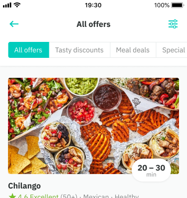
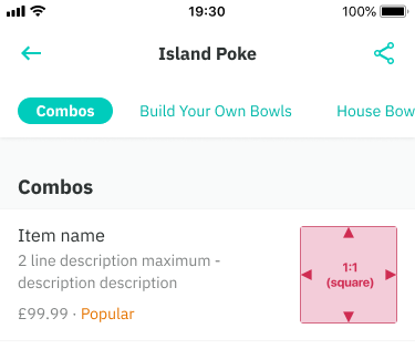
Tab bars
Tab bars allow you to either quickly navigate to different sections in a screen or provide the user with a set pre-defined filters.
- On scroll, the tab bars become a part of the sticky header, always giving you immediate access
- On mobile, the tabs overflow off the screen and can be accessed be horizontally swiping.
- On mobile while scrolling, if the tabs are used as a means of navigating inside that screen, the tabs will auto-highlight
- On web, once the tabs reach the max width more tabs overflow inside a “More” button
- Ideally, tab bars should be kept concise and to as few words as possible, although in the menu page use case we have no control as the content is done from the restaurants end
- Use when your screen has large amounts of content, ideally helping your user to make a decision
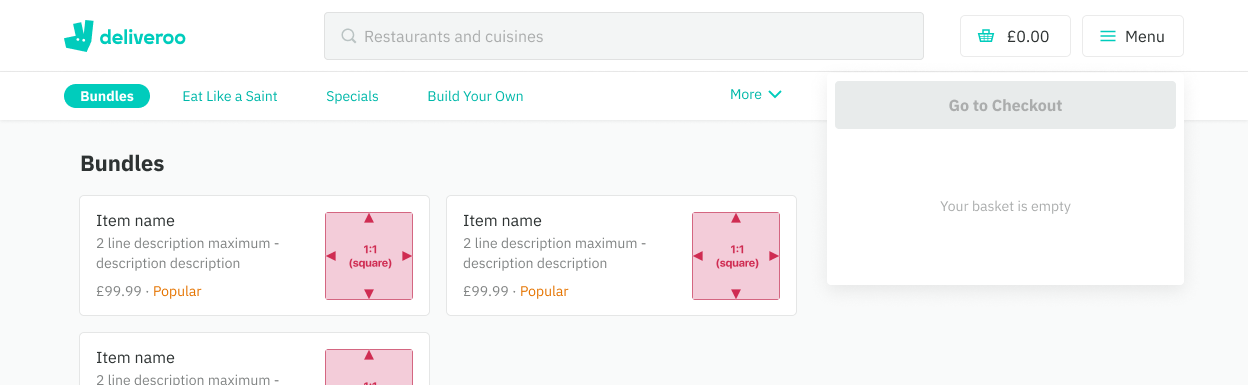
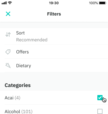
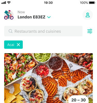
Filter tray
Filter tray is used as part of our filtering pattern on Consumer to display specific filters that have been applied to a set of content.
At a very basic level, the filter pattern involves:
- Tapping on a filter icon
- Selecting filters through sort, offers, dietary needs and categories
- The ability to apply or clear all selections made
- Displaying an updated set of results based on those applied filters
Use when you need to narrow down high volumes of content that vary greatly
Mobile
Segmented tabs
This is based off of Apple’s Segmented controls pattern. They are often used to display different views eg. in Apple Maps a segmented control lets you switch between Map, Transit, and Satellite views.
However, at Deliveroo they are used solely inside our Offers screen in Consumer to display different curated offers eg. Tasty discounts, Meal deals. This is an incorrect use of the pattern and the assumption as to why it’s being used is down to technical reasons vs tab bars.
Use tab bars if you wish to navigate to sections of content, use segmented tabs if you wish to switch between different types of views.
Mobile