Forms are a grouped set of inputs used to gather information in order to complete a task
Form layout
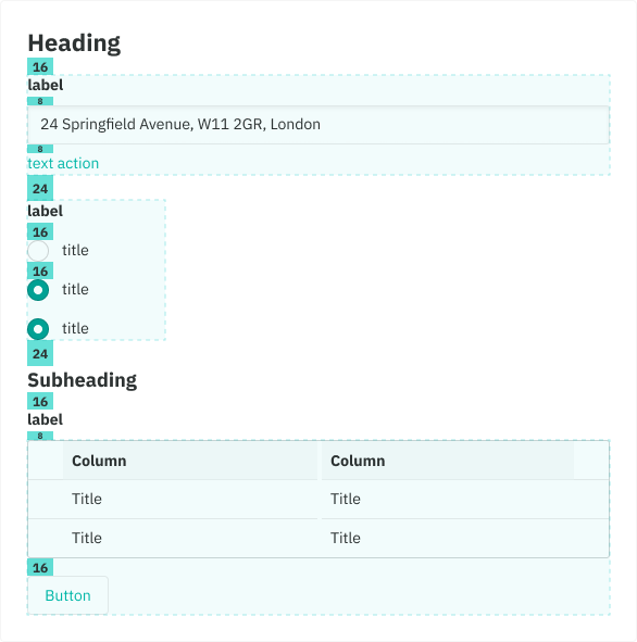
- Our form inputs are stacked vertically and top aligned in a single column. This makes them easier to scan, complete and behave well with translation. However, some cases allow two columns eg. a small group of inputs that require equal prominence.
- Related inputs should be grouped under a section title. This provides more context and a greater sense of hierarchy.
- Forms should be in a clear and logical order
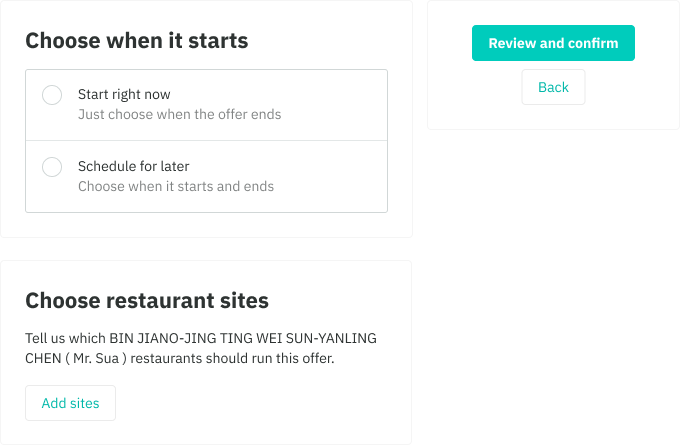
- CTA buttons are placed below the form and aligned to the right of the card. However, for more complex forms that include many cards, use the Aside Page Layout. This makes them more prominent.
Do
Don't
Padding and spacing
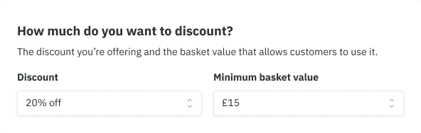
- Large 24 between groups of form elements, alternatively a divider may also be used
- Medium 16 for groups eg. checkboxes
- Small 8 between labels, inputs and helper text
- Medium 16 between checkbox and radio group labels
- Medium 16 between tables and buttons that's in the same form group.
Progressive disclosure
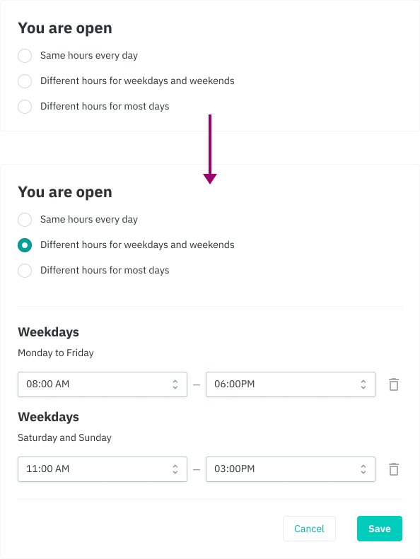
- Allows to show only a few of the most important options. Based on the selection made we can then show larger set of options that are more specialized.
- Helps maintain focus of a user's attention by reducing clutter, confusion, and cognitive load
- Also improves usability by showing only the minimum required for said task.
Helper text
Providing help for our customers is great. Including too much help is distracting and dilutes the value of providing help.
- Minimize the amount of help required to fill out a form.
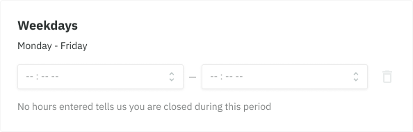
- Helper text can be used to provide guidance at an input or field level, such as how it will be used.
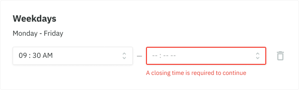
- Use error validation to help customers understand why a form input may be invalid and how to fix it.
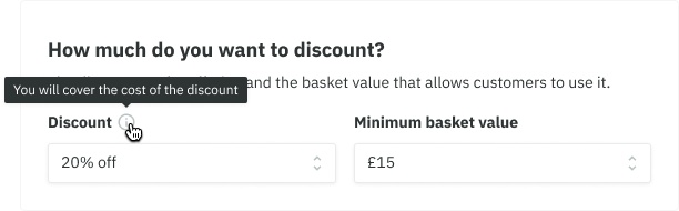
- Use a tooltip to provide additional information that is more general than how an input will be used. Keep in mind that this is not as optimal on mobile devices due to no hover states.
Smart defaults
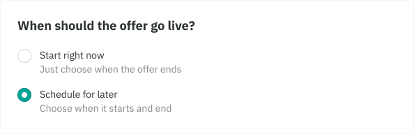
- Use smart defaults for inputs where it is reasonable to expect that the user would select that value and the cost of being wrong is minimal.
- This can remove friction, taking the burden of choice off the user.
Using the progress steps for long forms
Long forms should be broken into multiple pieces in order to create less intimidating and daunting forms while creating a more positive and simplified experience. We use the progress steps component for this.
- When you require a lot of information, such as creating an offer or ordering food from a supplier a progress steps would be beneficial
- This is currently only used inside our Aside Page Layout
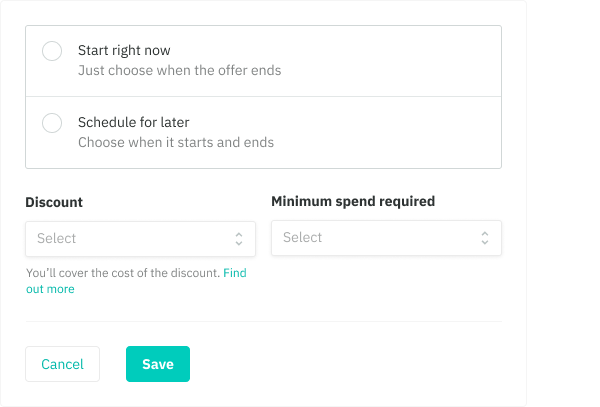
- When you only need one type of information from your users, such as inviting a team member then keeping the form to a single page is sufficient