A tooltip is used to display short, contextual information of a page element. This can be interacted with through hover, focus, tap or long press depending on the platform.
Our tooltips are dark, so that they contrast against our app’s UI.
Best practice
- Use to define the action or name of an interactive icon
- Use to provide additional help to/or define a page element or term eg. service fee.
- Use to reveal the full text of truncated data
- Use short, descriptive, helpful text. Some situations may require longer strings of text.
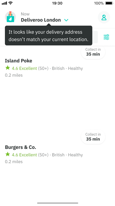
- Only use tooltips for information that is vital to task completion eg. delivery address not matching your current location.
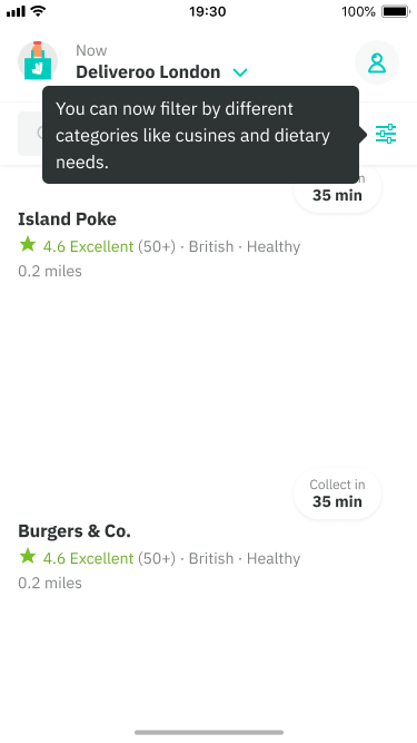
- Do not use tooltips for highlighting new features, only vital to task completion
- Placement: Position tooltips so they don’t block related content. The default is below but they can also be placed above, left and right for different cases such as an edge of screen element.
- Delays (web only): can be applied on the tooltip appearing and is most suited for repeated actions such as an interactive icon, there is no set delay but generaly 300ms is a solid starting point.
Do
Vital to task completion.
Don't
Highlights a new feature and is not vital to the flow (example).