Forms are a grouped set of inputs used to gather information in order to complete a task.
Usage
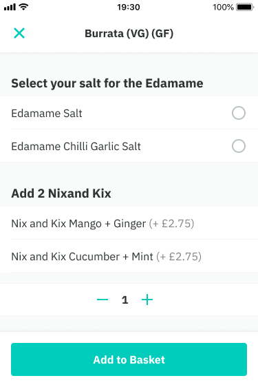
Forms themselves are very rarely used in PDS except for cases such as adding a new address or registering/updating account details. However, elements of forms exist throughout such as setting an arrival, selecting modifiers from a dish and the checkout flow. We also use form specific best practices such as progressive disclosure, smart defaults, helper text and error validation.
- dropdowns
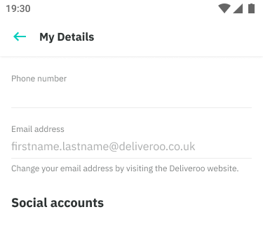
- text inputs
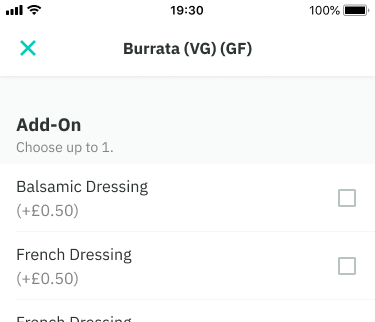
- checkboxes and radio buttons
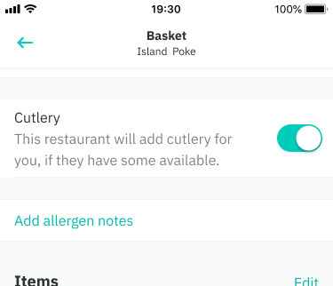
- toggles
- steppers
- clear CTAs


Form layout
- Our form inputs are stacked vertically and top aligned in a single column. This makes them easier to scan, complete and behave well with translation. However, some cases allow two columns eg. a small group of inputs that require equal prominence such as scheculing a later arrival time
- Related inputs should be grouped under a section title. This provides more context and a greater sense of hierarchy. Subtitles can also be used as a means of helper text.
- Forms should be in a clear and logical order
- CTA buttons are placed either directly below the form or as part of a sticky footer (basket/checkout and modals)
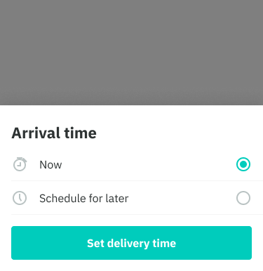
Smart defaults
- Use smart defaults for inputs where it is reasonable to expect that the user would select that value and the cost of being wrong is minimal.
- This can remove friction, taking the burden of choice off the user.
- Example: arrival time always set to ‘now’ based on the majority of customers using the app to order food immediately or cutlery options is toggled off based on the majority of the world becoming more health conscious.
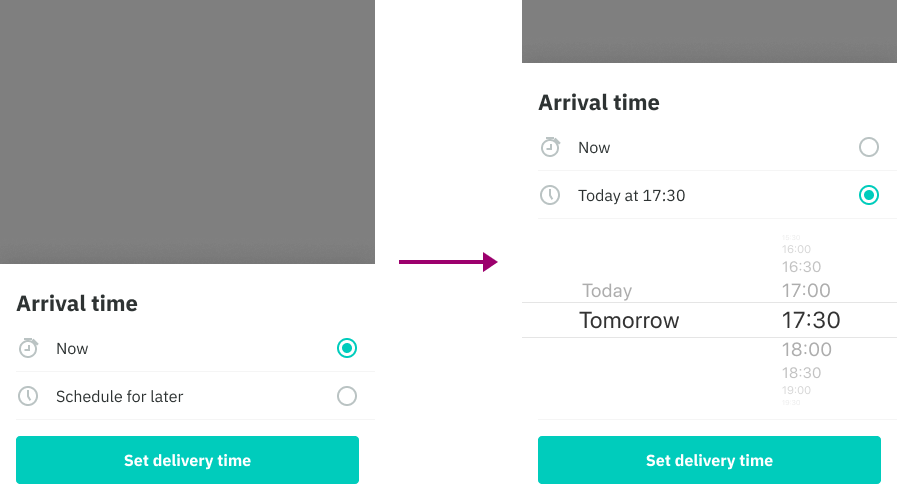
Progressive disclosure
- Allows to show only a few of the most important options. Based on the selection made we can then show larger set of options that are more specialized.
- Helps maintain focus of a user's attention by reducing clutter, confusion, and cognitive load
- Also improves usability by showing only the minimum required for said task.
- Example: when a customer is changing their arrival time from ‘now’ to ‘schedule for later’ , only once that option is selected do we show the required inputs
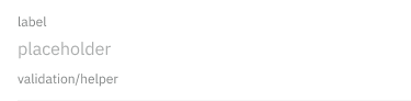
Helper text
Providing help for our customers is great, but including too much help is distracting and dilutes the value of providing help. Helper text be used only where it is really needed.
- Minimize the amount of help required to fill out a form through section titles and below inputs.
- Helper text can be used to provide guidance at an input or field level, such as how it will be used.
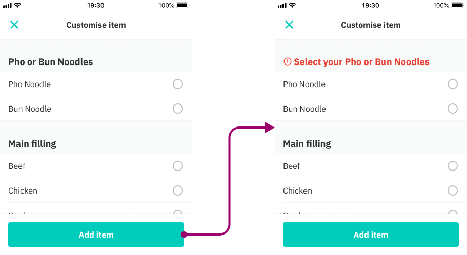
- Use error validation to help customers understand why a form input may be invalid and how to fix it.
- Use a tooltip to provide additional information that is more general than how an input will be used.
- Examples: unfamiliar data, specific data, concerns around security or privacy
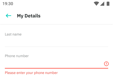
Validating errors
Validating errors gives people several types of real-time feedback: It can confirm an appropriate answer, suggest valid answers, and provide regular updates to help people stay within necessary limits. These bits of feedback can be presented before, during and / or after users provide answers. Ultimately it is to avoid confusion as much as possible.
Your message should communicate:
- What went wrong and possibly why.
- What’s the next step the user should take to fix the error.
We do this in two areas:
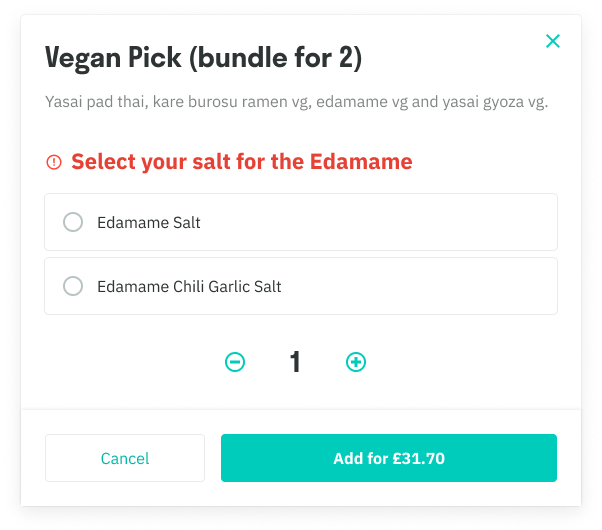
- List header level: The list/section headers change color and include a warning-circle icon. On Web and iOS, the title does a subtle bounce to direct focus to the area.
- Input level: The border changes color and a trailing icon and error text is now added.
CTA Buttons are never disabled in this situation because:
- Disabling the button prevents our chance to tell the customer what is wrong. The customer keeps clicking the button and is totally in the dark why nothing happens. Keep the button enabled. Let the customer click the button. Then show the message why they can’t proceed.
- This is especially crucial in cases such as selecting many options from a dish (menu item) on Mobile which is very large list. It is easy to skip over error messages. Keeping the CTA interactive should anchor you directly to the message.
- They give no feedback as to why they are disabled when you click them.
- Certain screen readers and voice overs skip over disabled buttons.
iOS + Android
Required option/modifier (dish option)
Input level
Web